The Story
Before there was the Rose Bowl, before baseball’s first World Series, the first Indy 500, and decades before golf’s Masters, the best players in tennis came to Cincinnati, Ohio for a very special tournament.
It was called the Cincinnati Open.
The names have changed. The game has changed. But one thing remains: they still come to Cincinnati.
The Cincinnati Open, a name cherished by both fans and players since its founding in 1899, stands as a testament to the rich history and evolution of tennis that’s woven into the fabric of the Cincinnati region. In the world of tennis, it’s been a beacon, uniting fans and players alike in the spirit of competition and camaraderie.
The Cincinnati Open means embracing the tournament’s true identity, an identity that’s synonymous with unparalleled access to players, authentic Midwestern hospitality, a passionate and loyal fan base and the unique opportunity to see both the top men’s and women’s tennis talent in the world in the same place at the same time.
The place matters, the people matter, the players matter. At the Cincinnati Open, it’s more than a spectator sport; it’s a connection, a shared experience that transcends the traditional boundaries between fans and athletes.
Experience the heart of tennis, where the world’s best gather, showcasing tennis excellence against the backdrop of the Cincinnati region’s warm embrace. The Cincinnati Open, where every experience is a celebration of what has been and what’s yet to come.
The Logo
What began as a Cincinnati staple in 1899 has now become an annual event of global proportions. The Cincinnati Open welcomes players and fans from around the world, embracing them with a level of hospitality and intimacy that’s distinctive to our tournament. Tennis serves as the connection point, uniting generations, cultures, backgrounds and beliefs together in shared cheers and moments of awe. Hosted on a global stage yet grounded in our local roots, the Cincinnati Open is a celebration of the power of tennis and the people who make it great.
Right click on the images below to download our logo.
Primary
One Color
Alternate
The Colors
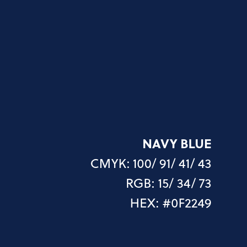
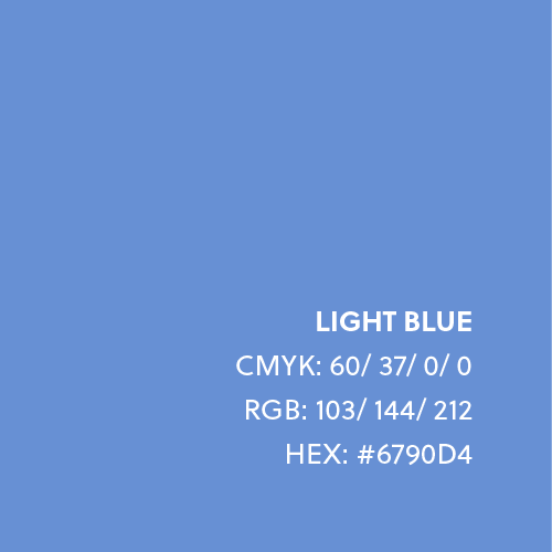
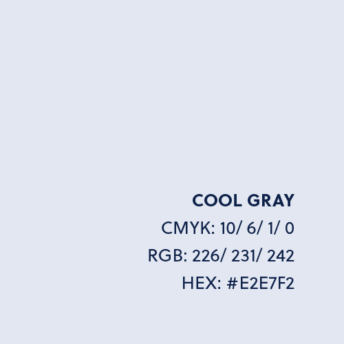
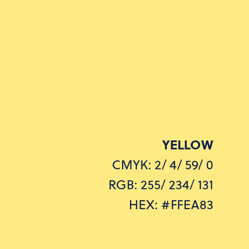
Navy blue is the primary color of our brand. It should always be used and can be supported by touches of both light blue and yellow when needed. Light blue and yellow are important accent colors and should be used subtly. They can be used in graphic elements or to highlight small portions of text.
Gradients
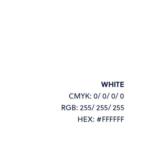
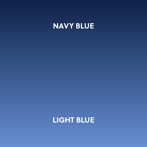
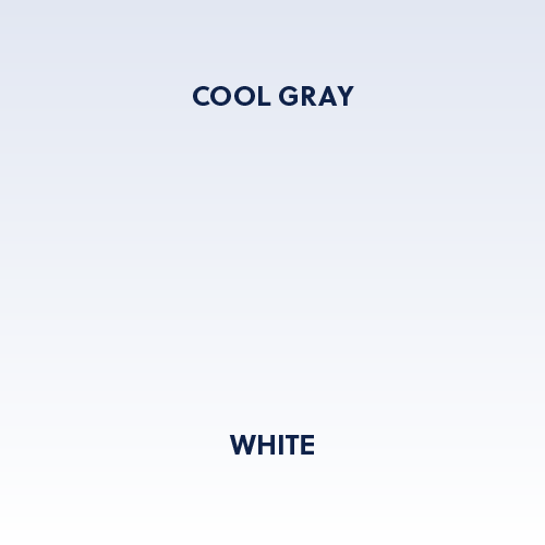
Gradients may be used in the background to add dimension. There are two options. The dark gradient uses navy blue and light blue. The light option uses cool gray and white.
The Fonts
Soleil is our primary typeface. Alfarn is our headline font and should be used in all caps. Soleil Regular is our text font and should be used in sentence case. Alfarn is our button font. Other font weights should be used as necessary for legibility.
HEADLINE
SECONDARY
TEXT


